Good Friday Morning, Uni Watchers! Hope everyone is doing well as we get ready for the weekend. It’s been quite a whirlwind first week for me at the helm of this fine ship, and I want to thank each and every one of you for your kind words and support! This is going to be a fun ride, and thanks for joining me.
Now then.
Last evening, the Toronto Blue Jays unveiled their City Connect (CC) uniforms, confirming the earlier leak. Depending upon your perspective, it’s either worse or better than first imagined.
As with every CC, the uniform must be considered within the parameters of the storytelling, and there is plenty of it here. We’ll start with the obligatory hype video…
The skyline.
The neighbourhoods.
The people.
The heartbeat of the city. @SimuLiu knows what our City Connects mean to Toronto! #TOTHECORE pic.twitter.com/0tvrltdZMB— Toronto Blue Jays (@BlueJays) May 30, 2024
The tagline for that video is:
“The skyline.
The neighbourhoods.
The people.
The heartbeat of the city.”
There were a few glimpses of the uniform in the video, and we’ll get to pictures and some screen grabs momentarily.
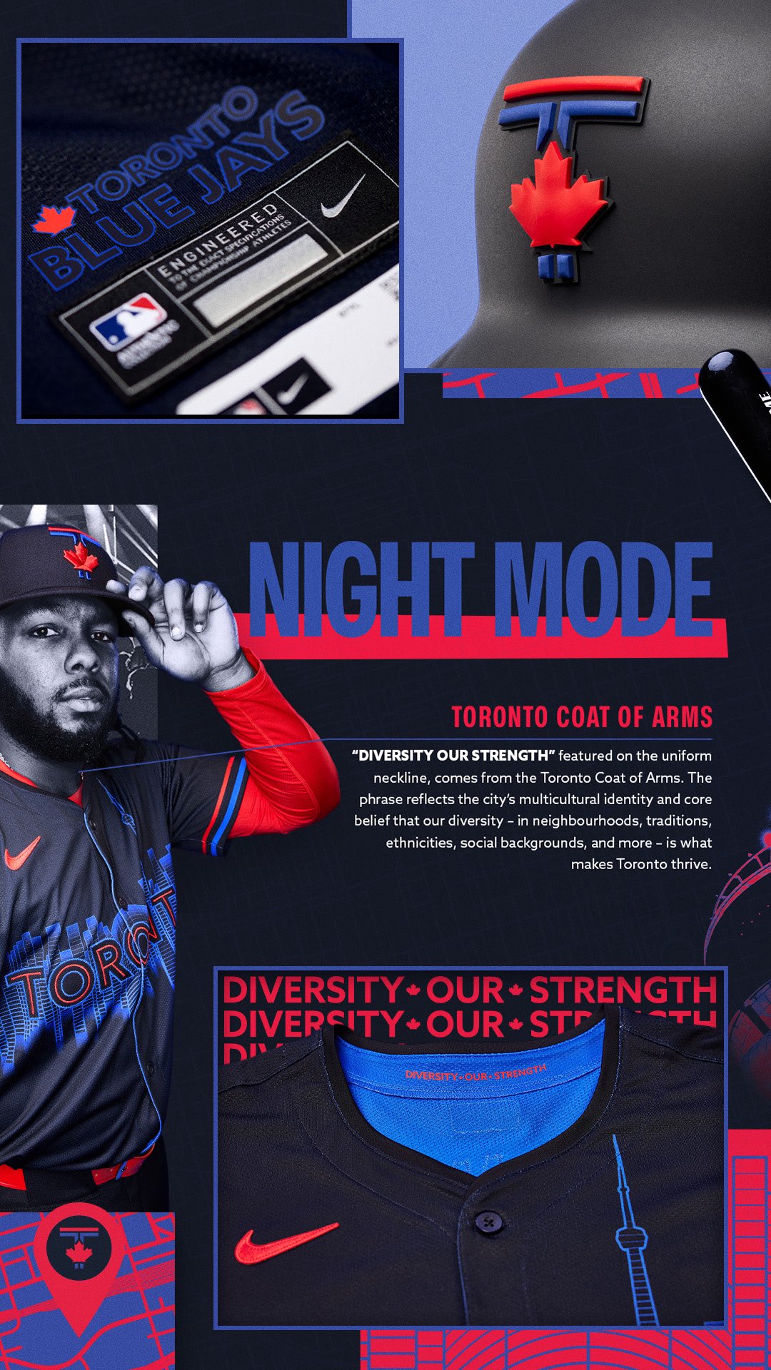
The Blue Jays have given their CC a title: “Night Mode,” which as you’ll see is probably pretty apt (it’s a “tribute to the city’s nightlife”). They also provided some handy-dandy storytelling to accompany it. I’ll post those now without additional comment.

If you can get past the almost embarrassing (some might even say “vomit-inducing”) storytelling/corporate-speak, those four graphics actually do a pretty good job describing the various elements of the uniform.
Another video has been produced which also provides the “back story” — and it too does a nice job in highlighting the different facets of the uniform, though the vapid monologue is more storytelling nonsense. It’s got captions, so you may want to turn the volume down.
Here’s an explainer of all the details on the Blue Jays City Connect uniform 👀 pic.twitter.com/UD7TDHuqf1
— MLB (@MLB) May 30, 2024
So, let’s toss out all that storytelling and look at this solely as a uniform.
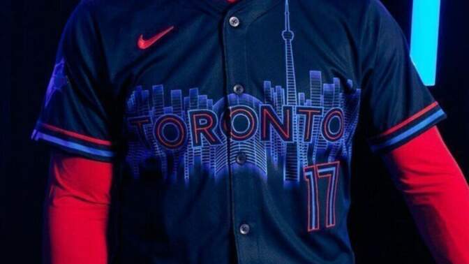
What we have here is a mono-dark uniform — the team is calling it “Pitch Blue” although it’s so dark it almost appears to be black.
CAP

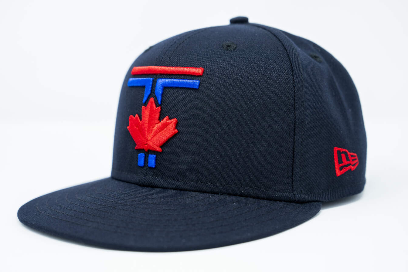
It’s a pretty nice cap (as least as far as CC caps go), and it features a “split” T, with the top bar in red, and lower bar and base in royal blue. A red maple leaf bisects the T. That is supposed to evoke the “Pillars of City Hall.” YMMV.
JERSEY

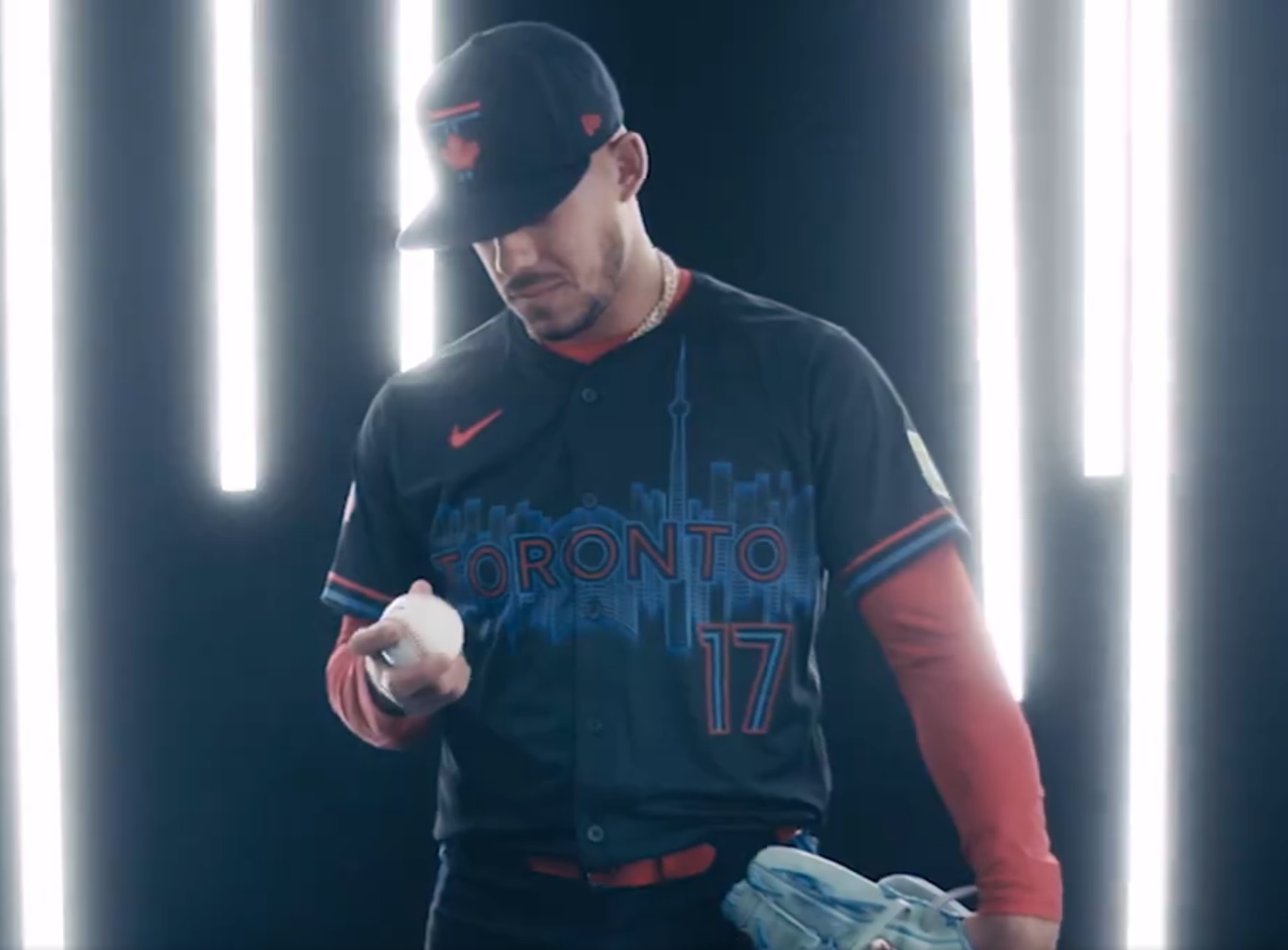
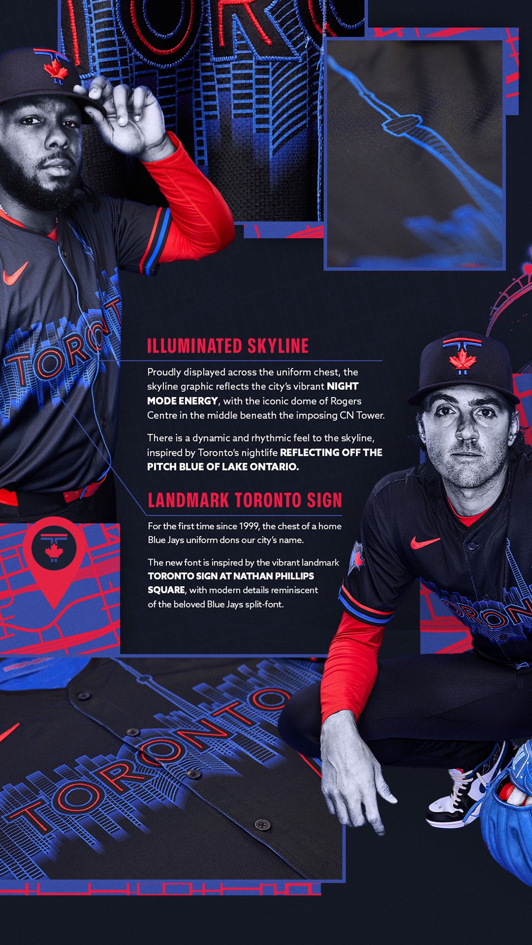
As we saw in the leak, the front of the jersey has “TORONTO” across the chest, atop an image of the Toronto skyline, designed to show a reflection on Lake Ontario. The CN Tower is a prominent feature of that skyline, and that is reflected in this sublimated graphic (although the top of the tower doesn’t seem to be reflected below the horizon, which is an interesting design decision, and aesthetically, it’s probably for the best). The TORONTO wordmark is both a harkback to the old script, and to the TORONTO sign, an illuminated three-dimensional sign in Nathan Phillips Square in Toronto. Rendered in red and Pitch blue and outlined in royal blue, it sits horizontally across the jersey. Jersey numbers are on the lower left side, in the same font style as “TORONTO.”
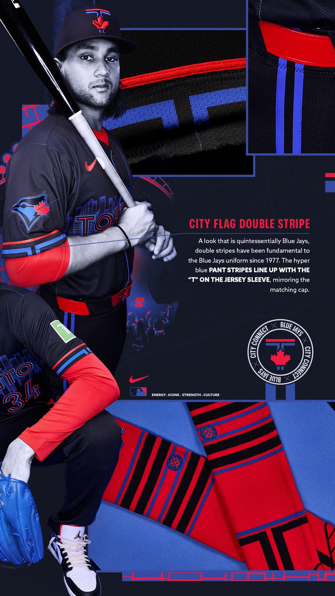
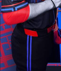
Jersey sleeves are red and royal blue, with the blue opening at the midpoint to form a partial “T” — which matches the split “T” on the cap. On one sleeve will be an ad, while the opposing sleeve features a new birdhead logo.
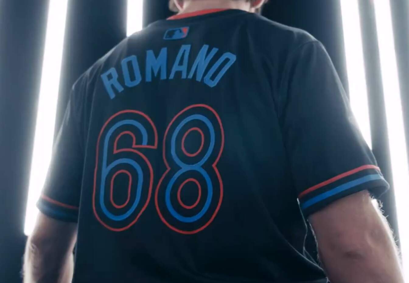
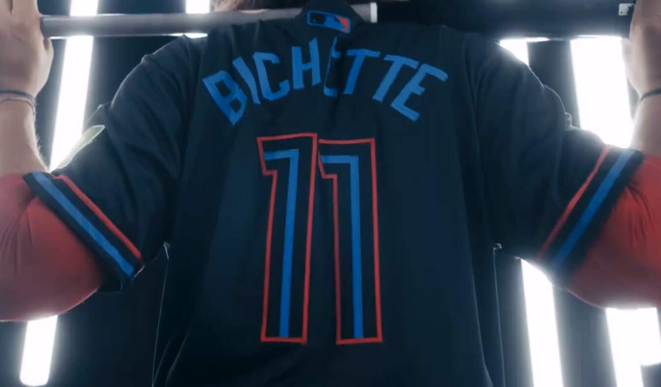
The back of the jersey shows a radially arched NOB in royal blue, while numbers are in the same font/style as on the front.
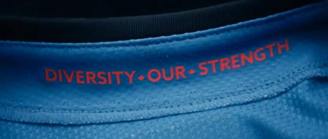
As we had seen in the leak, the inside of the collar features the words “DIVERSITY OUR STRENGTH” which is Toronto’s motto.
PANTS/SOCKS
Unfortunately there are only fleeting glimpses of the pants, but they will also be the same dark shade as the jersey and cap, and will have two royal blue stripes running down either side. If you jump back up to the photo of the sleeve, the pants stripes align with the break in the lower blue vertical stripe where the image of the “T” is formed (although it’s a bit difficult to note the alignment in the photo below).
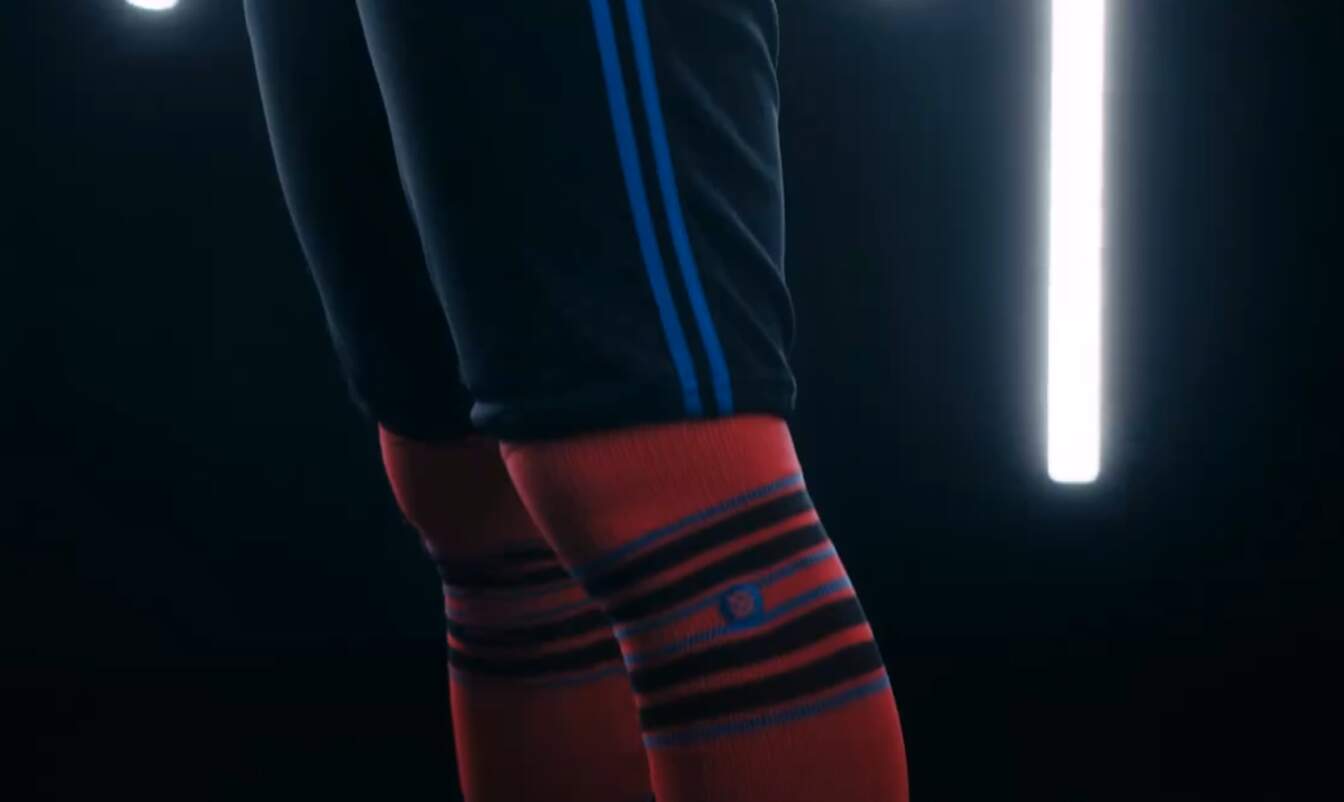
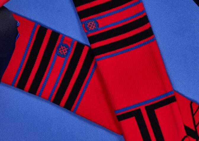
For those who choose to go high-cuffed, the CC socks are red, with alternate stripes of Pitch blue and royal blue. At the base of the sock is another split T graphic.

However, from what we have been able to see (and to try to assess it without the storytelling), there are some good and some bad features. I don’t mind MLB uniforms where jerseys and pants are the same color, so I don’t mind the mono-dark. The cap is respectable enough, and I like the jersey/pants striping. I’ll definitely need to see it on the field, but I like the way the team has handled the striping, in particular the way the horizontal split “T” of the royal blue stripe aligns with the vertical royal blue pants stripes. The new birdhead logo is fine.
Unfortunately, the wordmark atop the skyline graphic seems excessive and too busy. TORONTO doesn’t stand out enough, and the graphic itself seems to dominate overall. I get what they’re going for (and of course the essence of a CC uniform is to tie in elements of the city), but this seems to be an instance where something that looked fine on a monitor didn’t quite translate to a physical jersey.
It appears that those players who wear long sleeves will be wearing red, and that will help contrast issues. Couple this with (mostly) red socks for those who go high-cuffed, and it will nicely break up the mono-dark of the jersey, pants and cap. For those who do not cuff, or who may choose dark compression sleeves, that effect will be muted. Again, this is something we’ll need to see in action.
You can read more in this press release (be forewarned: it’s a lot of storytelling/corporate-speak).
These CC uniforms will make their on-field debut tonight, and our new Weekend Editor, Jim Vilk, should have additional coverage of them tomorrow.
The Jays are one of nine MLB teams getting new City Connect uniforms this season. Here’s the rundown on the other eight teams:
Some Cap Oddities in Mid-century Old-Timers' Games
Got a note from longtime reader/contributor Ferdinand Cesarano yesterday, which highlighted some oddities he found in some Old Timers games. It’s too good (and a bit too long) for the Ticker, so I’ll post it here. I’ll let Ferdinand take it from here.
I am reading the wonderful book When The Giants Were Giants by Peter Williams, about Bill Terry and the Giants of the 1920s and 1930s. Included in the book are several photos, including a couple of Terry at old-timers’ days at Yankee Stadium in the 1950s.
The first shows Terry with Joe DiMaggio in a photo dated as 1954.
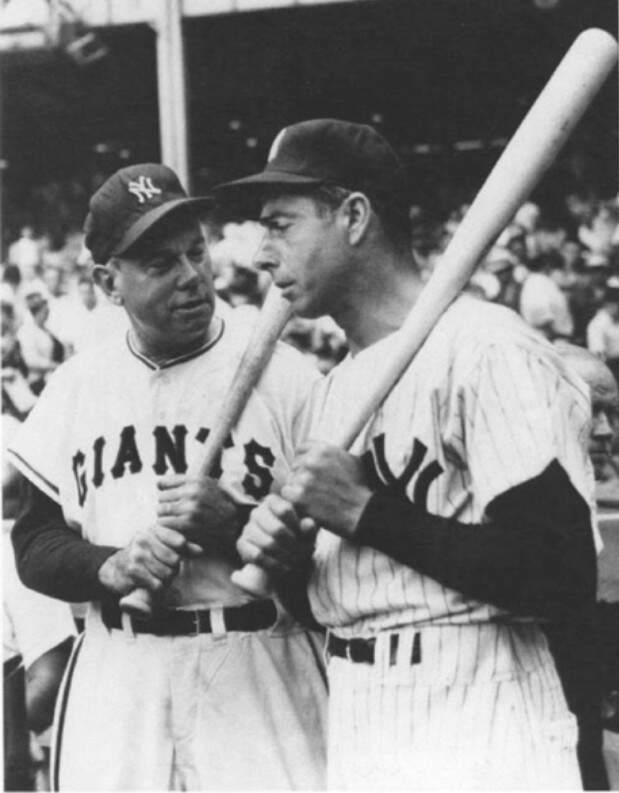
Note that Terry is wearing a Yankee cap!
In a photo dated only as “1950s”, we see Terry in a group that includes Hal Schumacher, himself, Rogers Hornsby, Hank Gowdy, Dave Bancroft, and Dick Bartell.
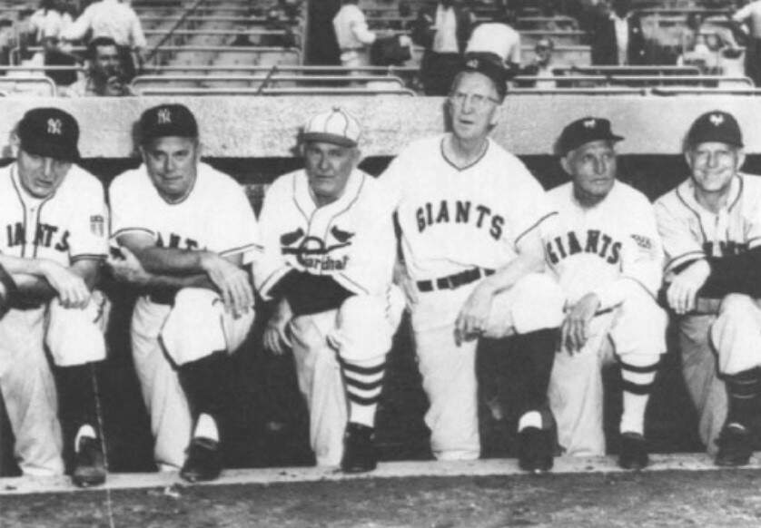
Terry is again wearing a Yankee cap, as are Schumacher and Gowdy, while Bancroft and Bartell wear Giants caps.
By way of comparison, I will refer to a photo that I am sure that you have seen, the photo of the DiMaggio brothers at the Giants’ 1962 old-timers’ day, at which they wore Giants road uniforms.
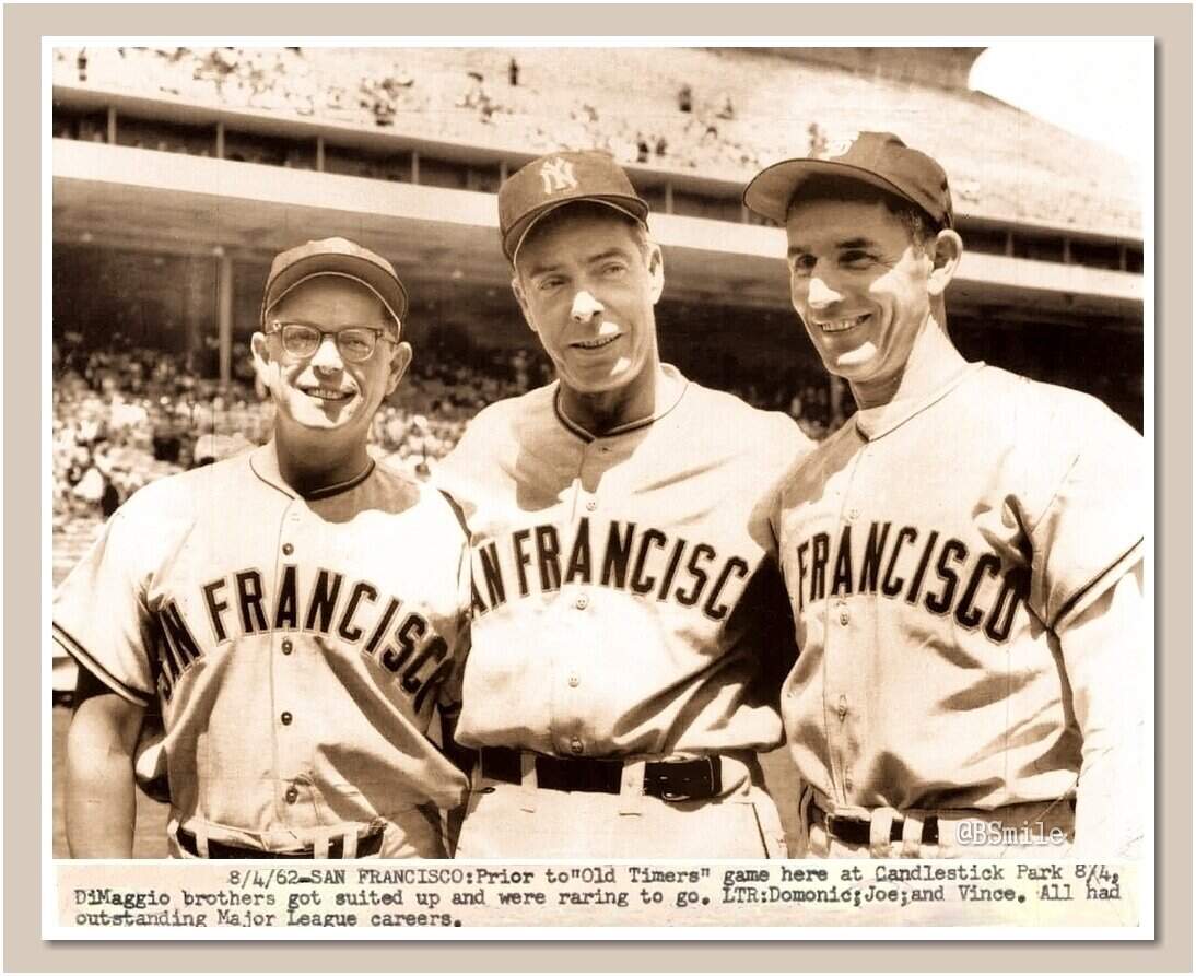
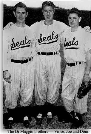
Those uniforms are clearly meant to stand in for the uniforms of the San Francisco Seals, a team with which all three brothers had played.
And we can understand that, because obtaining San Francisco Seals jerseys in 1962 would probably not have been easy.
However, obtaining a New York Giants cap in the mid-1950s would have been as simple as sending a clubhouse boy over to the Polo Grounds to pick one up. So I cannot understand why the Yankee cap is being used as a means of standing in for the Giants cap.
And finally...
…that’s going to do it for the early lede. I’ll have at least two more articles today, plus a Ticker, so be sure to keep checking back throughout the day.
Thanks again to everyone who has helped to make my first week in the Post-Paul era a great one. It’s my honor and pleasure to be your new captain — we’re all Uni Watchers first and foremost — and it’s your feedback and contributions that make our ship sail.
Everyone have a great weekend, and be sure to check out new Weekend Editor Jim Vilk’s first full weekend. He’ll do a great job and I know I can count on you guys to be as supportive of him as you have been of me.
Peace,
PH
https://news.google.com/rss/articles/CBMibGh0dHBzOi8vdW5pLXdhdGNoLmNvbS8yMDI0LzA1LzMxL3Rvcm9udG8tYmx1ZS1qYXlzLXVudmVpbC1uZXctY2l0eS1jb25uZWN0LXVuaWZvcm1zLWNvbmZpcm1pbmctZWFybGllci1sZWFrL9IBAA?oc=5
2024-05-31 11:25:47Z
CBMibGh0dHBzOi8vdW5pLXdhdGNoLmNvbS8yMDI0LzA1LzMxL3Rvcm9udG8tYmx1ZS1qYXlzLXVudmVpbC1uZXctY2l0eS1jb25uZWN0LXVuaWZvcm1zLWNvbmZpcm1pbmctZWFybGllci1sZWFrL9IBAA
Tidak ada komentar:
Posting Komentar